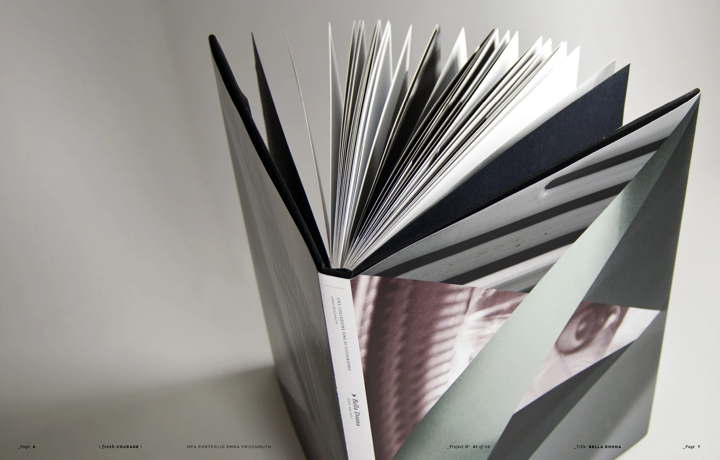
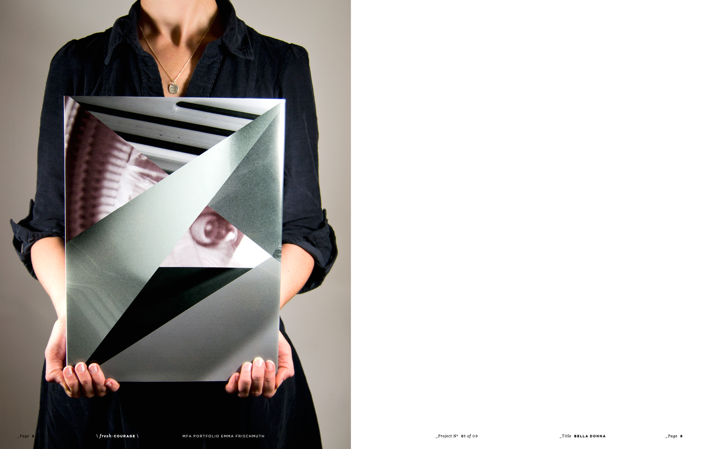
This project challenged me to tap into the essence of a brand and communicate it in an extraordinary way. I approached the classic Italian brand, Vespa, and created a new experience around the beauty of their products from the point of view of a woman.
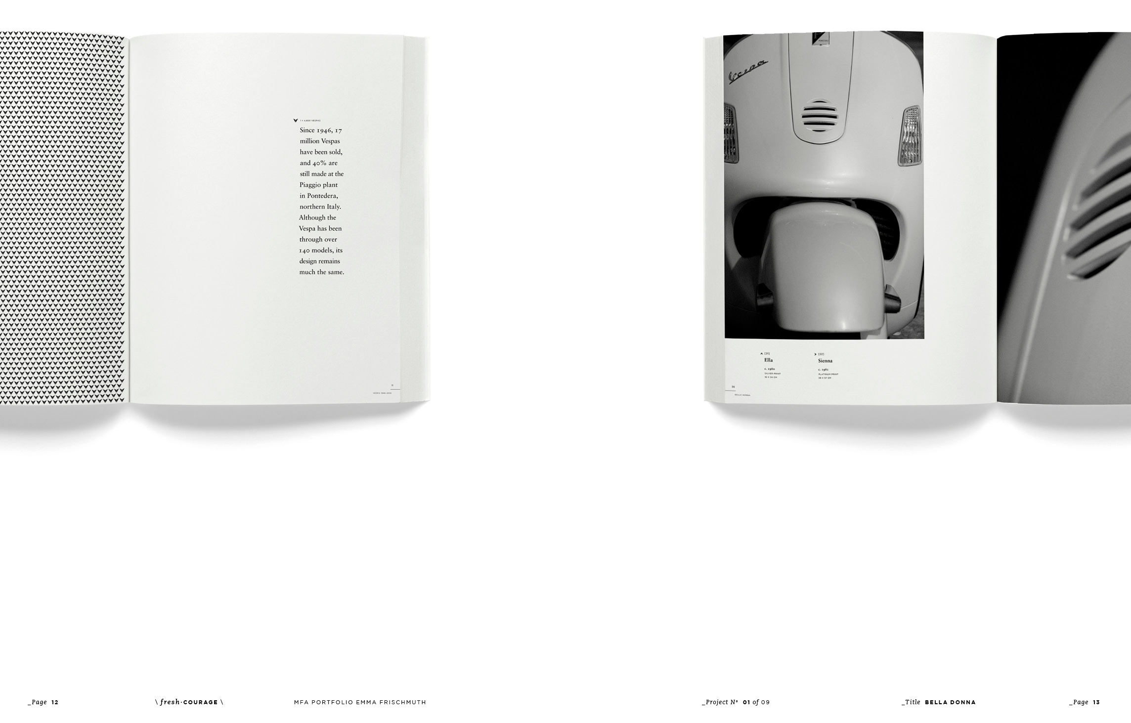
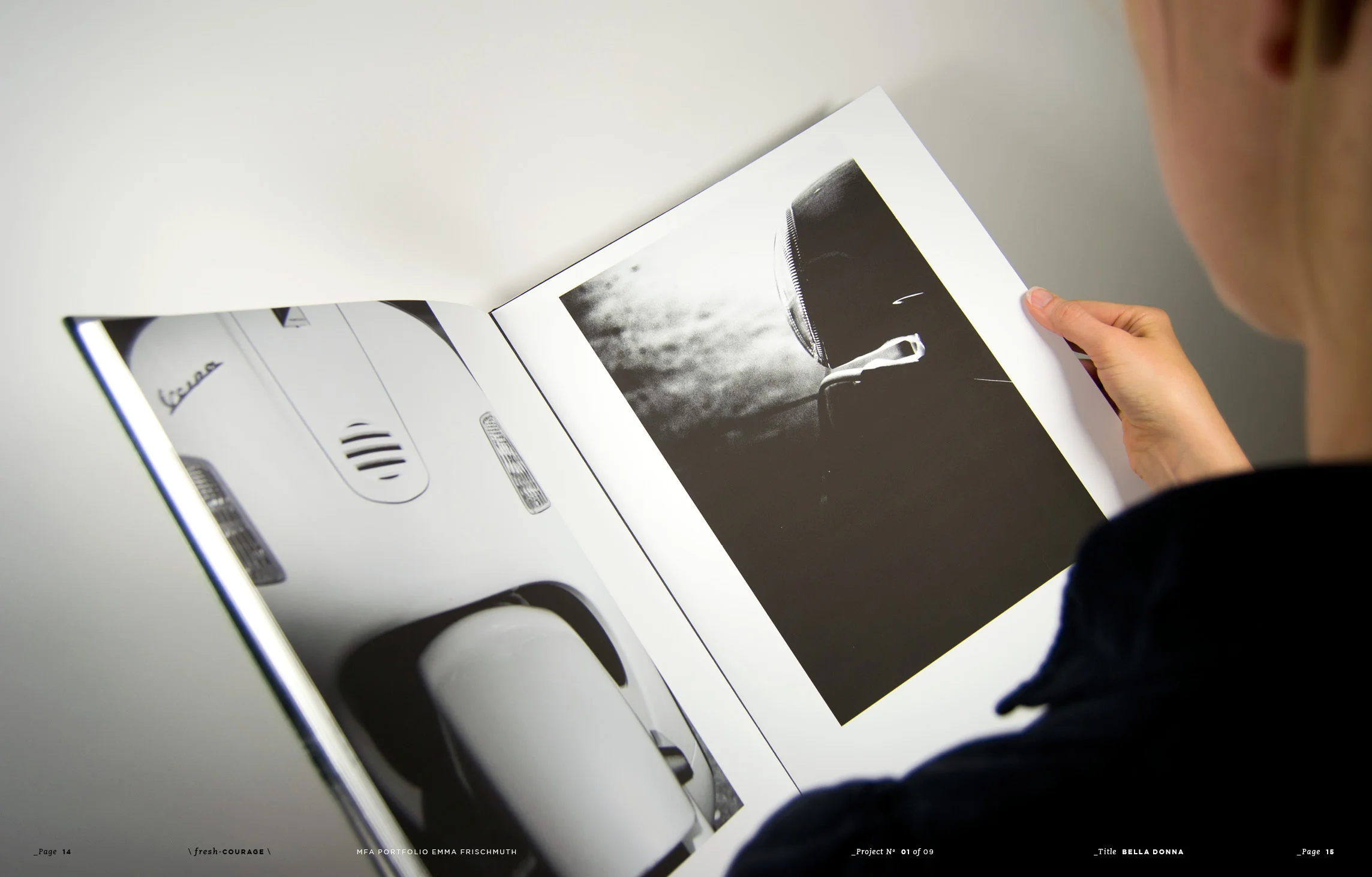
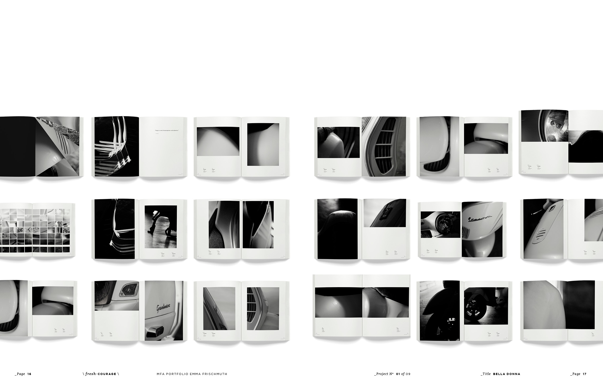
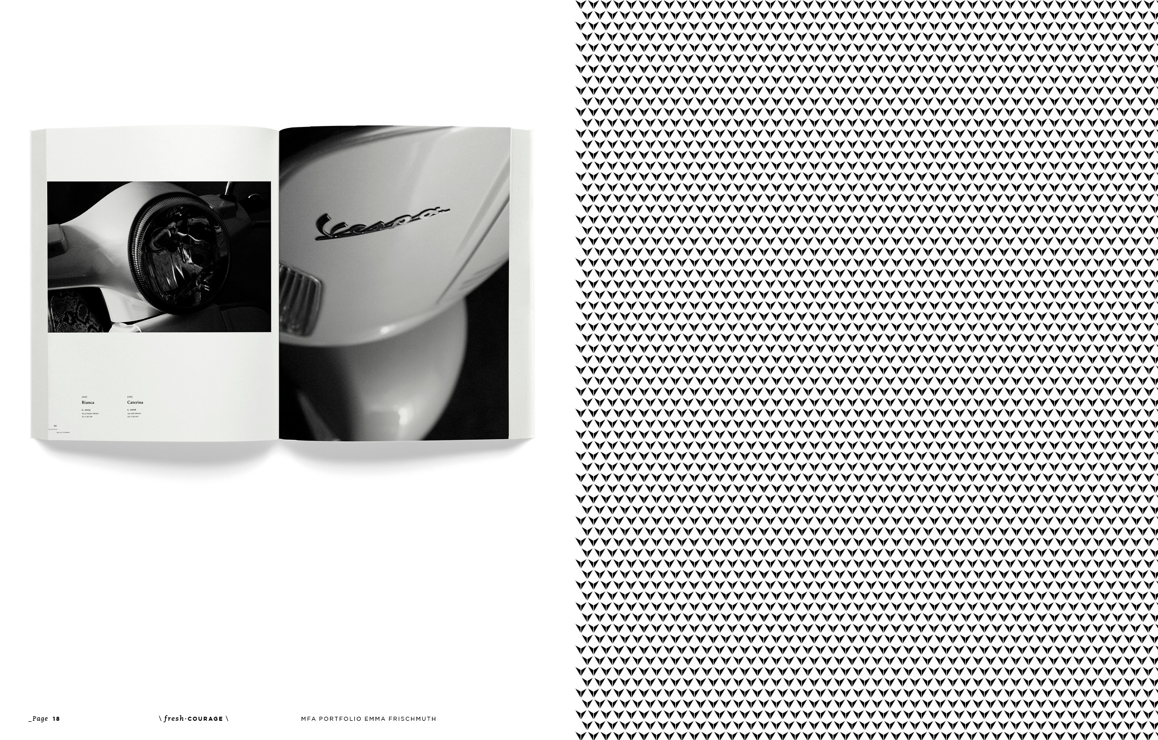
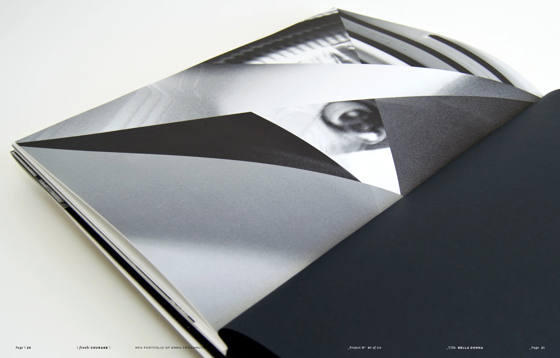
Once a utilitarian mode of transportation, the Vespa is transformed from an everyday object into a “bella donna,” or beautiful woman through a series of original photographs. The figure of the Vespa is displayed elegantly and simply through this collection of close-up, intimate, and sensual portrait images. Rather than viewing a scooter as simply an object, I looked at the Vespa as a strong, sexual, and commanding woman. Each photograph is given a woman's name, reinforcing the idea that these are not images of a vehicle, but instead portraits of beautiful women. The Vespa ceases to be an object, and its shape is transformed into desirable curves of a body.
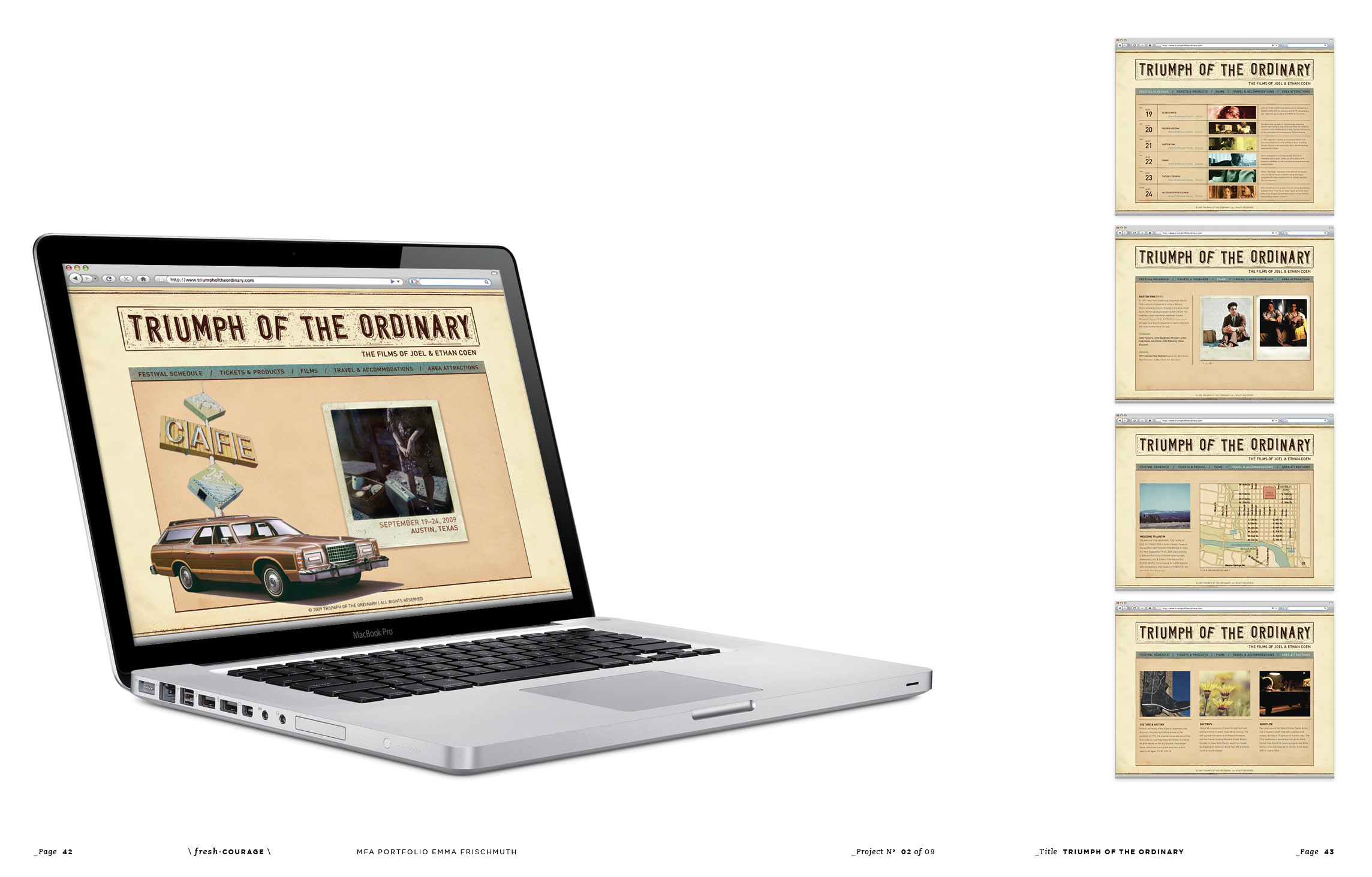
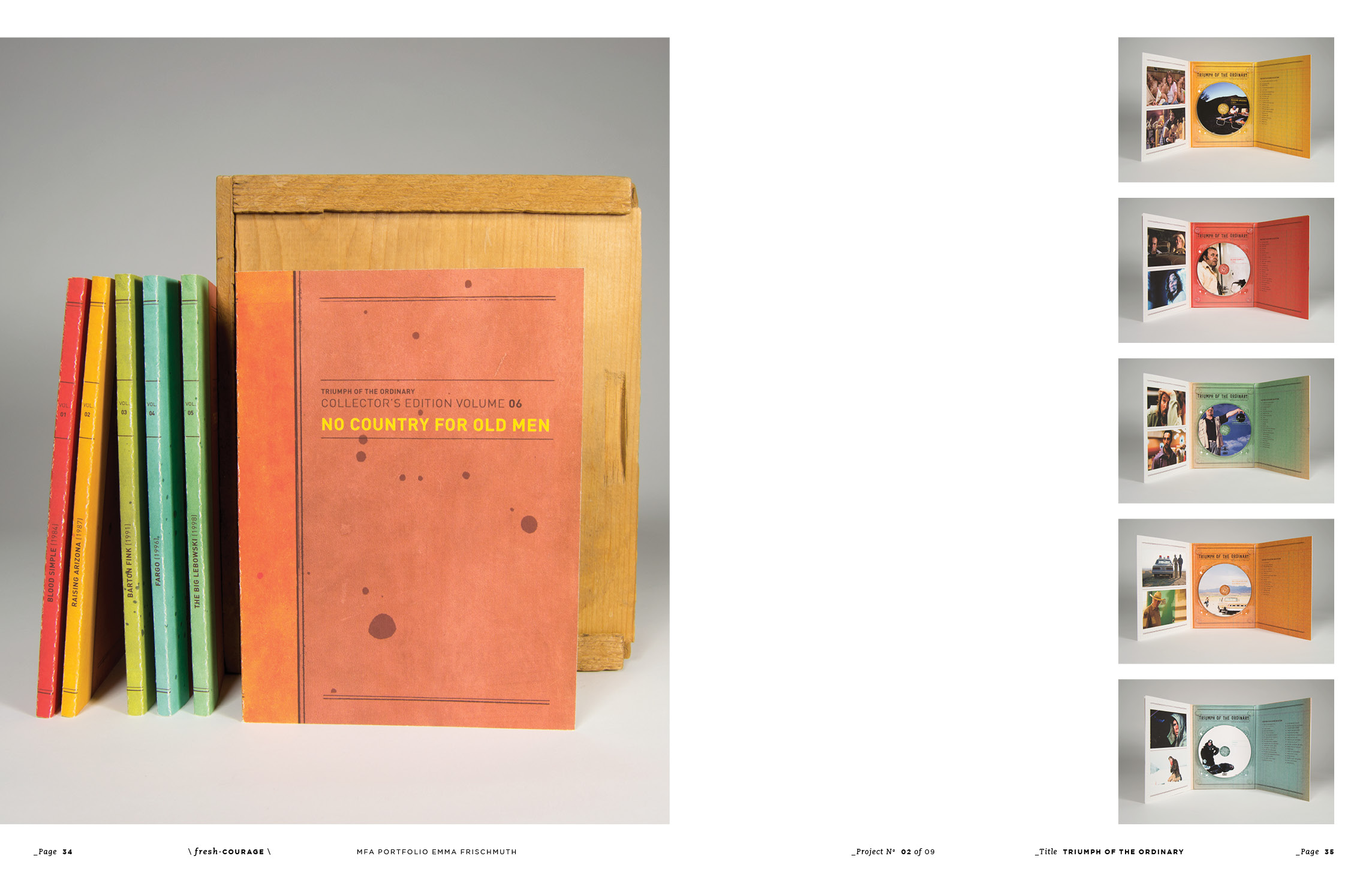
Triumph of the Ordinary, The Films of Joel & Ethan Coen explores the thread of ordinary people in extraordinary circumstances. More often than not, something goes wrong in the everyday life of a character, or a significant decision is a turning point in the character's “normal” life. These good, yet somehow flawed, characters find themselves involved in situations and events that often prove to be their ruin in the end. Most of the Coens’ movies are also set in the past and I wanted to create an experience that takes on this nostalgic character. I chose Austin, Texas as the venue for the festival because it is reminiscent of locations in several of their movies, which is also reinforced through a colorful, warm palette. Final deliverables include an identity system, posters, advertisements, DVD packaging, catalogue, schedule, tickets, festival souvenirs, and website.
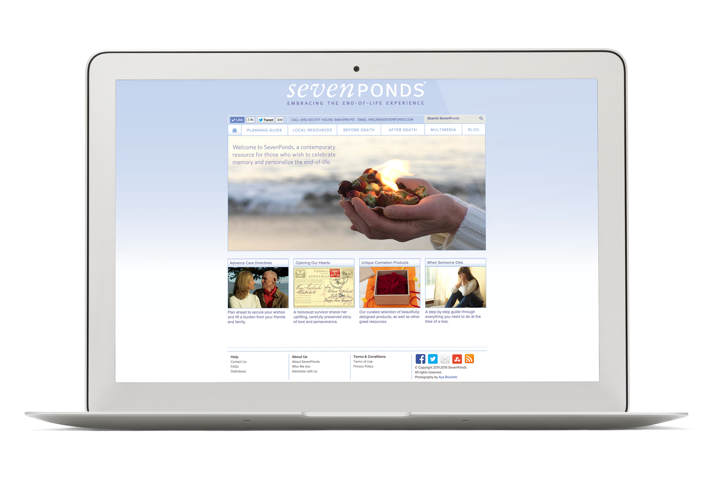
The culmination of the graduate program at AAU, my Master’s Thesis showcases my design skills though a complex 18-month project. After passing an initial proposal review, I worked with design professionals to complete my thesis, and to develop and launch the sevenponds.com site.
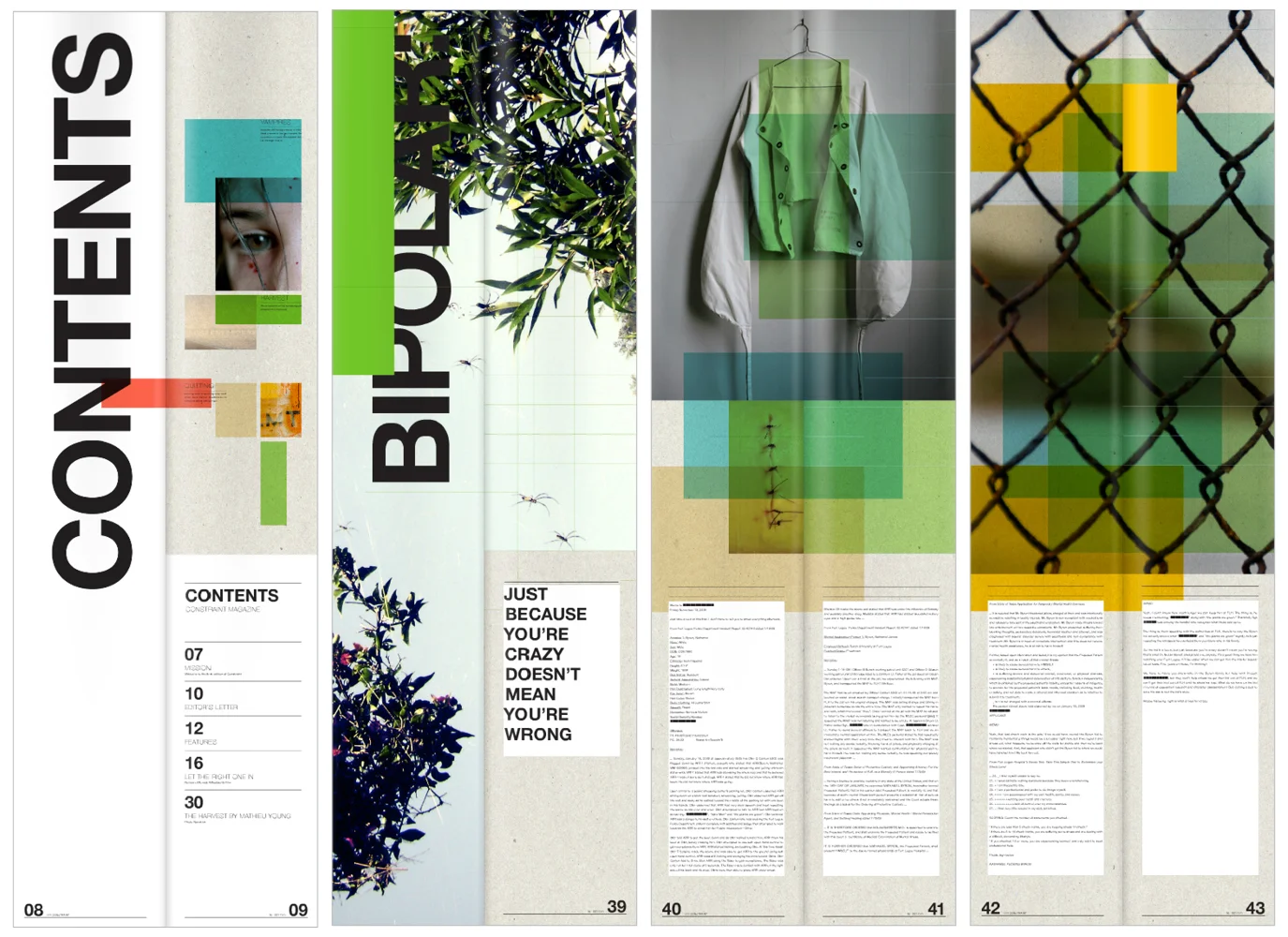
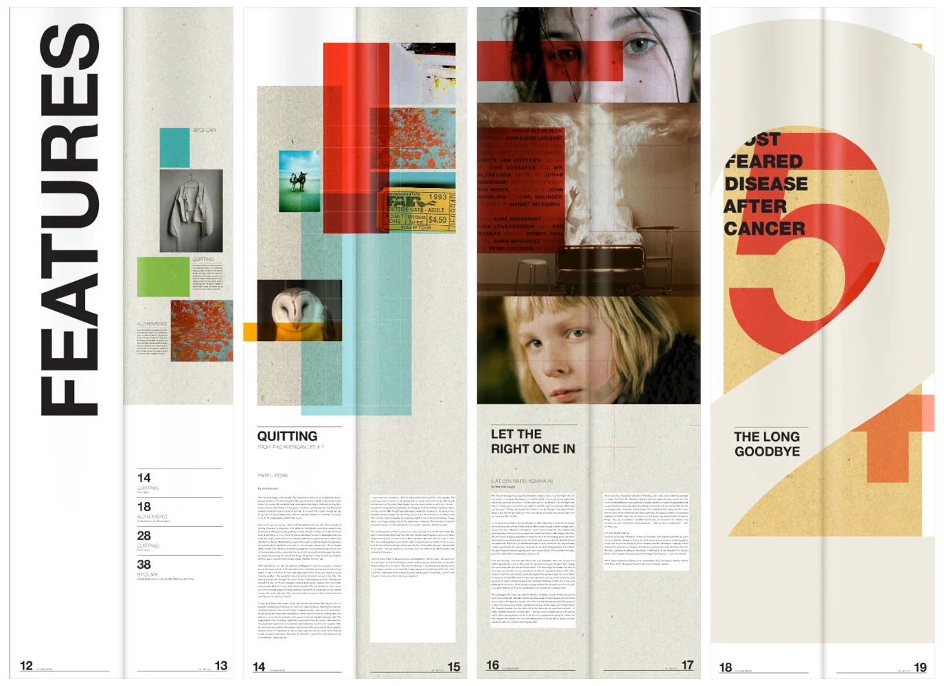
The San Francisco creative agency, Words Pictures Ideas, asked me
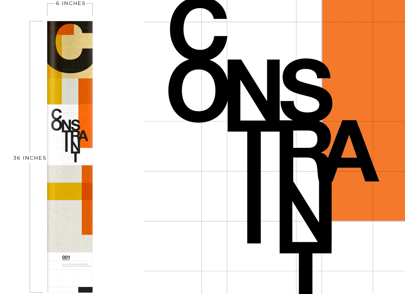
develop a concept for an extraordinary semi-annual publication under the premise of constraint. I had to work within the constraint of a set page size of 6 by 36 inches. Other than this stipulation, I was free to explore design, orientation, materials, structure, direction, content, and shipping logistics.
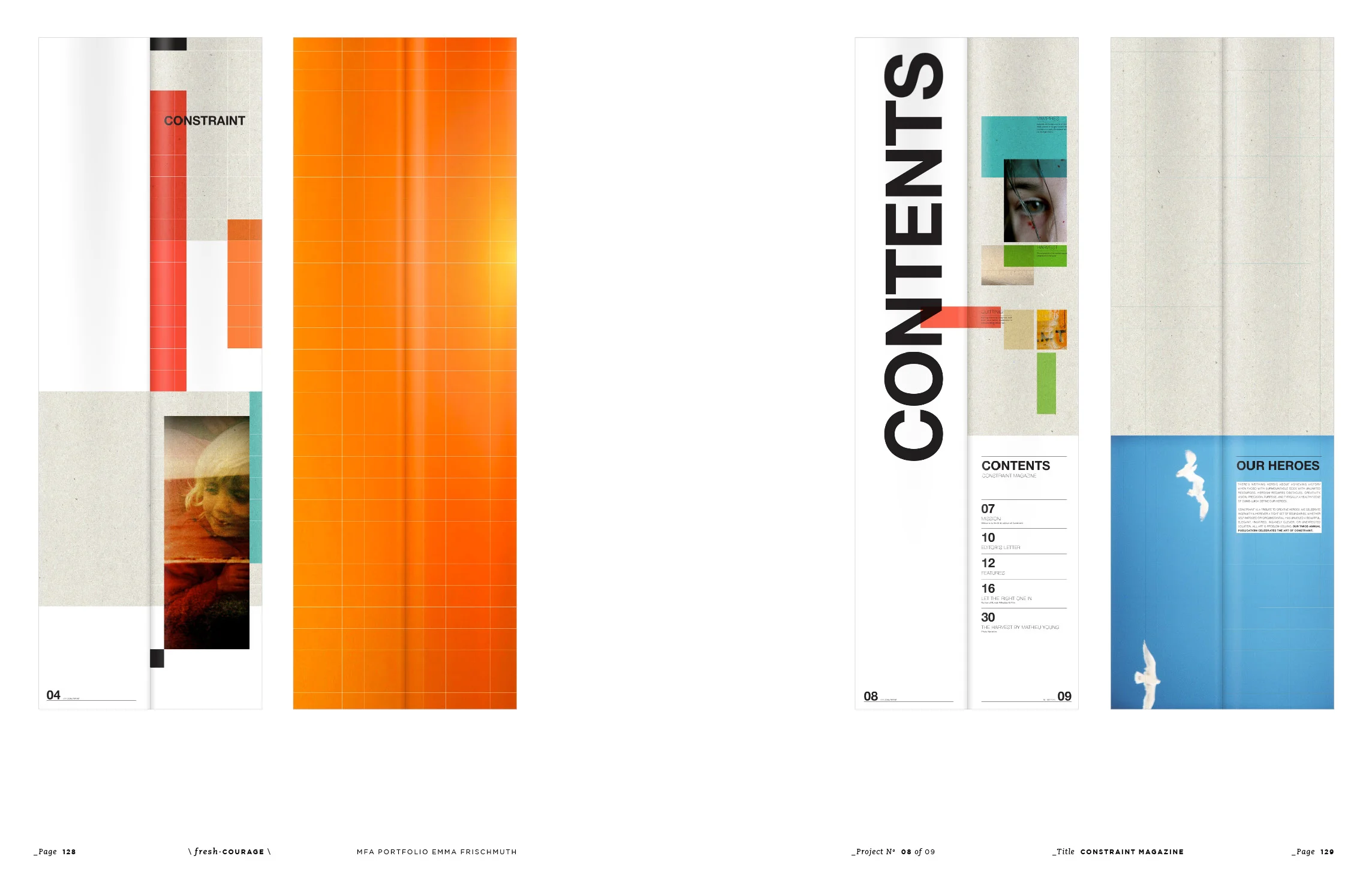
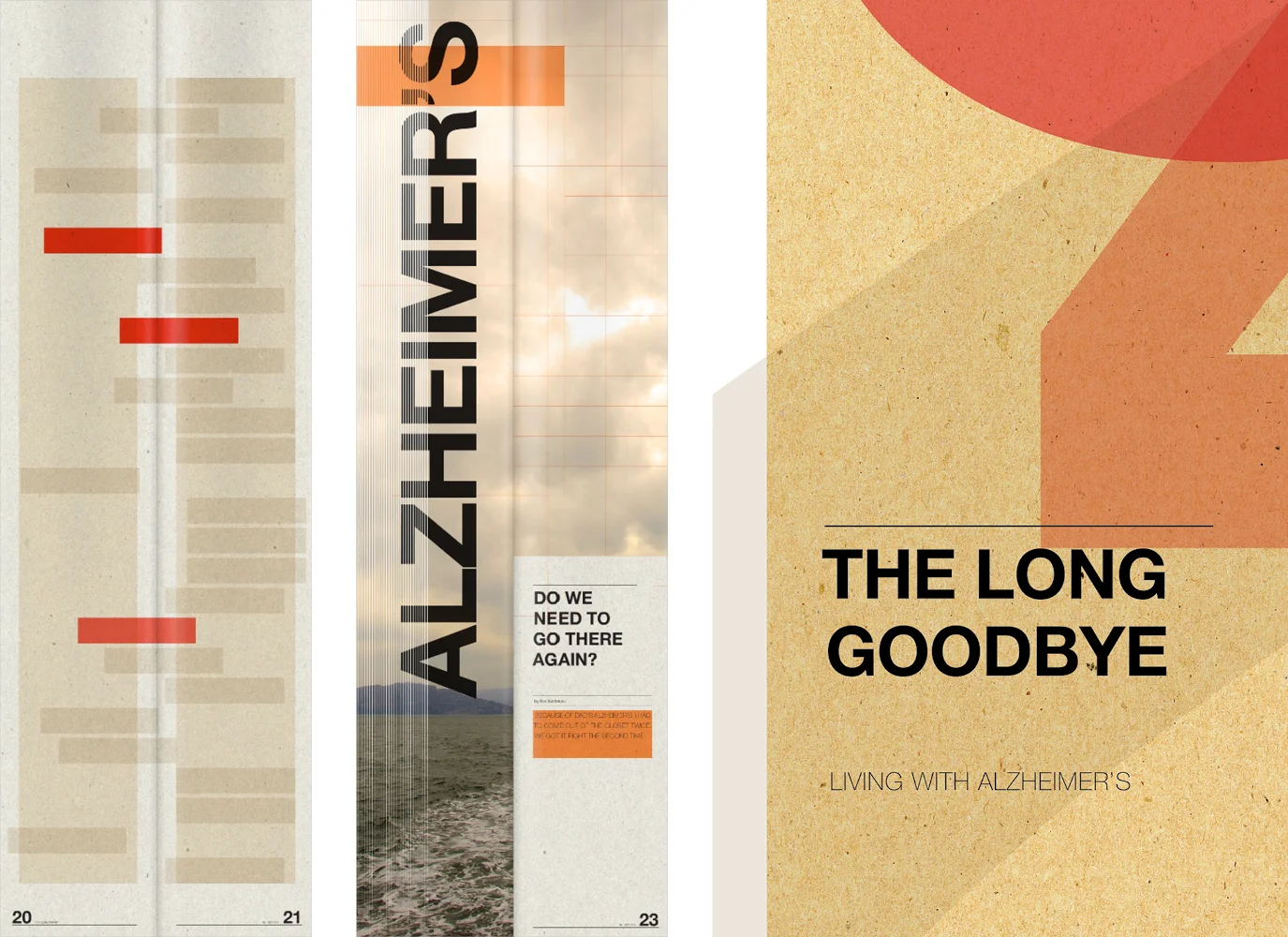
Constraints are like requirements such as having limited resources, they can be decisions that restrict the way something is designed or developed, or they can be self-imposed restraints about how we feel, act, or think. After much discussion and exploration about what constraints are, what they could be, and what it means to break them, I developed feature articles and designed compelling layouts with this always in mind. Every article also keeps with the underlying theme and includes original content about a bipolar diagnosis, what quitting means, living with Alzheimer's disease, losing control, and a photo series about the government control of marijuana.
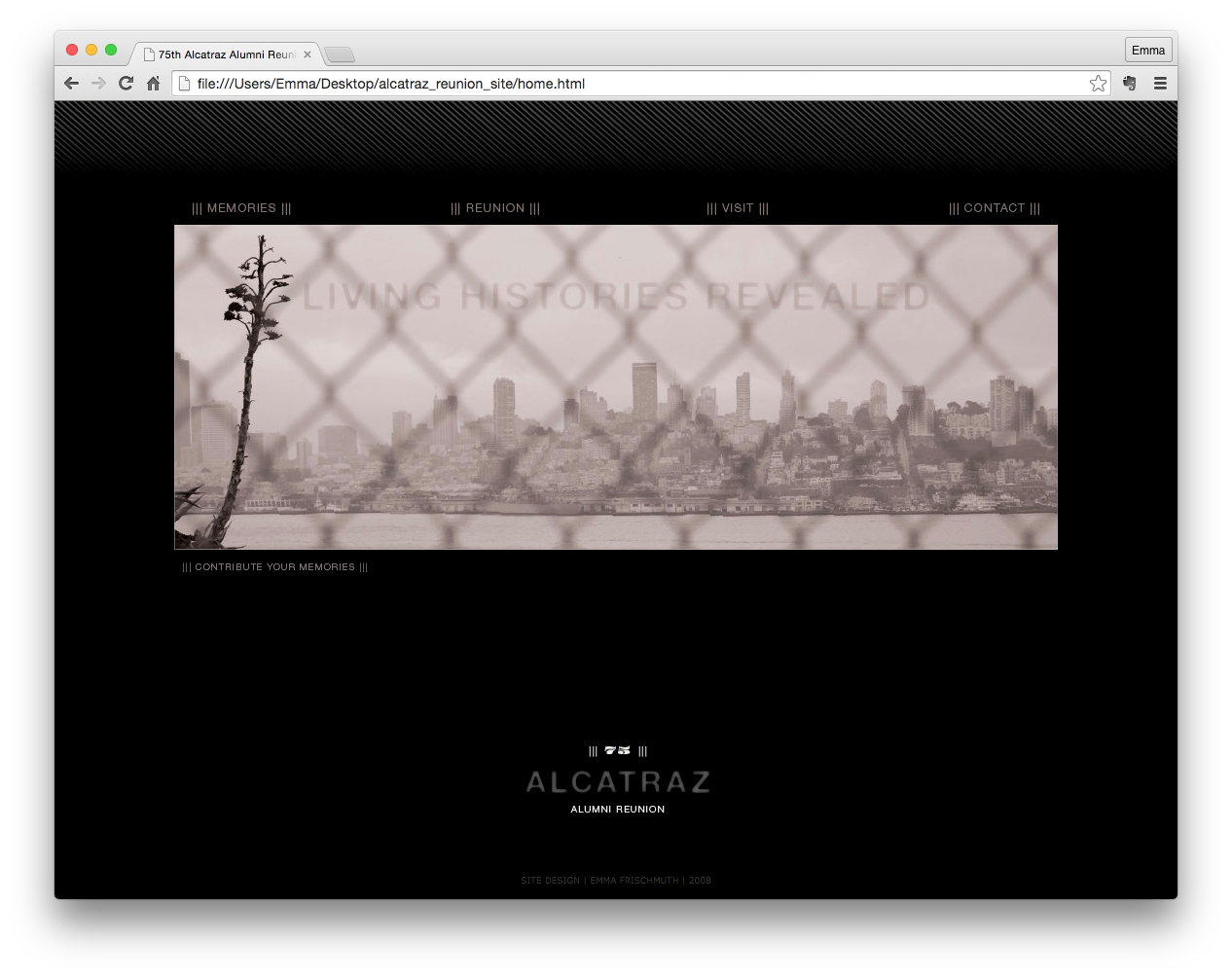
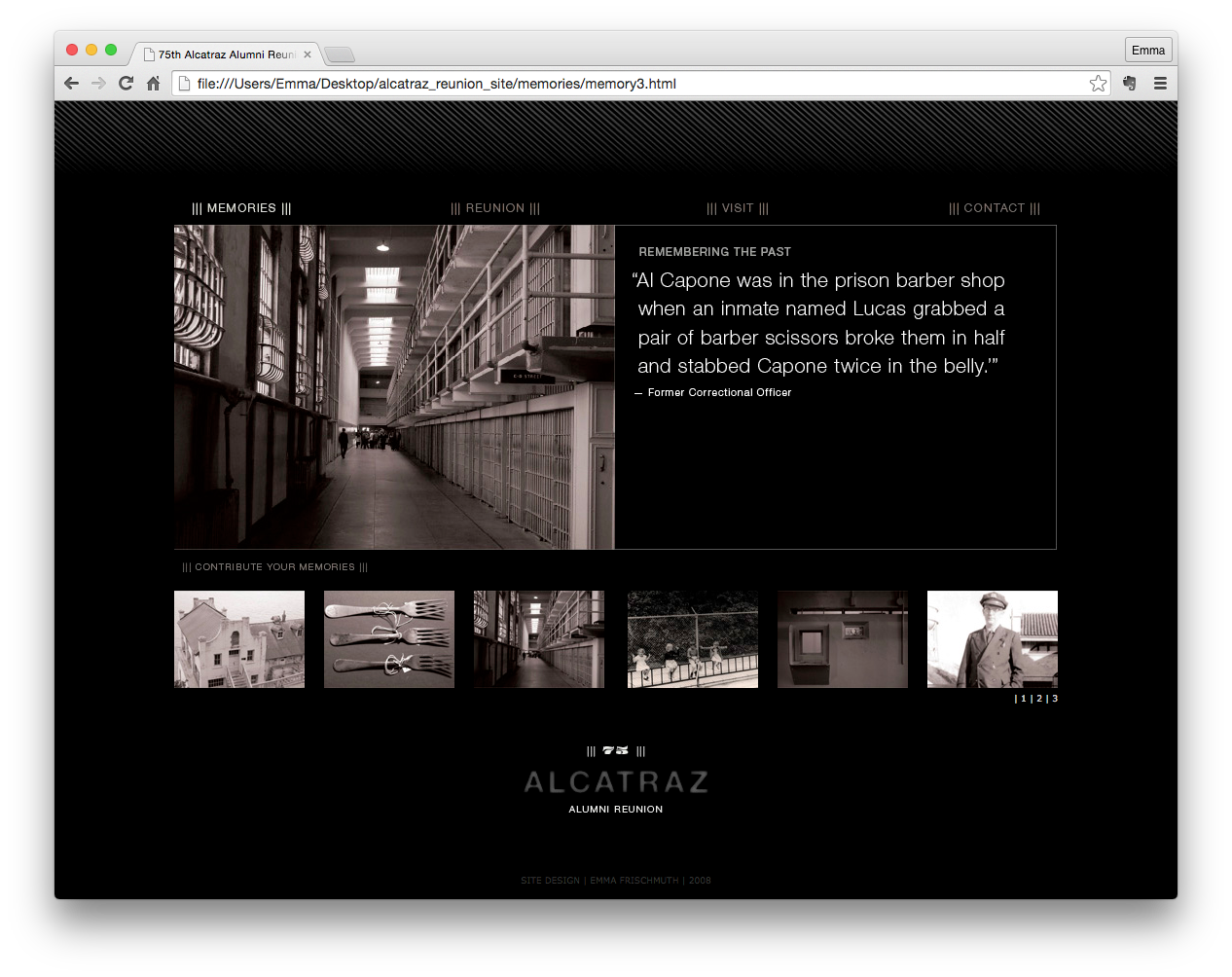
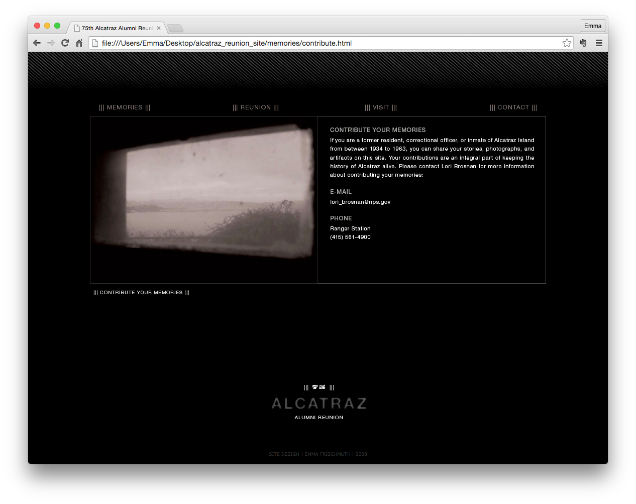
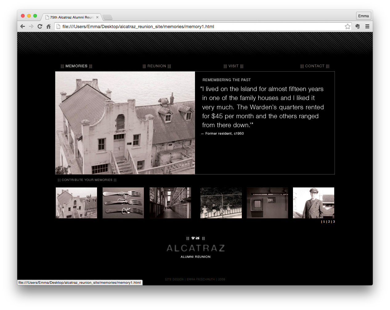
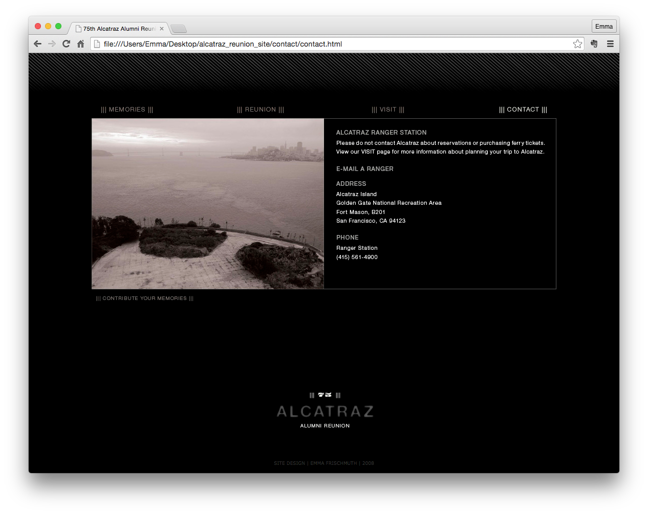
This mini site was created in Dreamweaver with original photography to promote The 75th Alcatraz Alumni Reunion. The living witnesses of Alcatraz Island—the inmates, prison guards, and families—are vanishing into the past, as the inhabitants grow older. The past can be alluring, especially if someone has an interesting story to share. The 75th Alcatraz Alumni Reunion is a chance for alumni to share their living histories and connect with younger generations, as well as with past neighbors. The alumni get to be heroes for a day and the public can ask them about what it was like being an inmate, a prison guard, or perhaps what it was like growing up as a kid on the island. This is an opportunity for a first hand account of history to help preserve the past and celebrate future of Alcatraz Island.
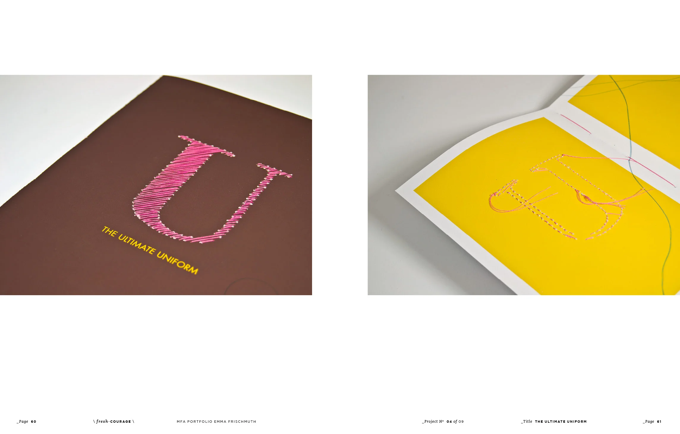
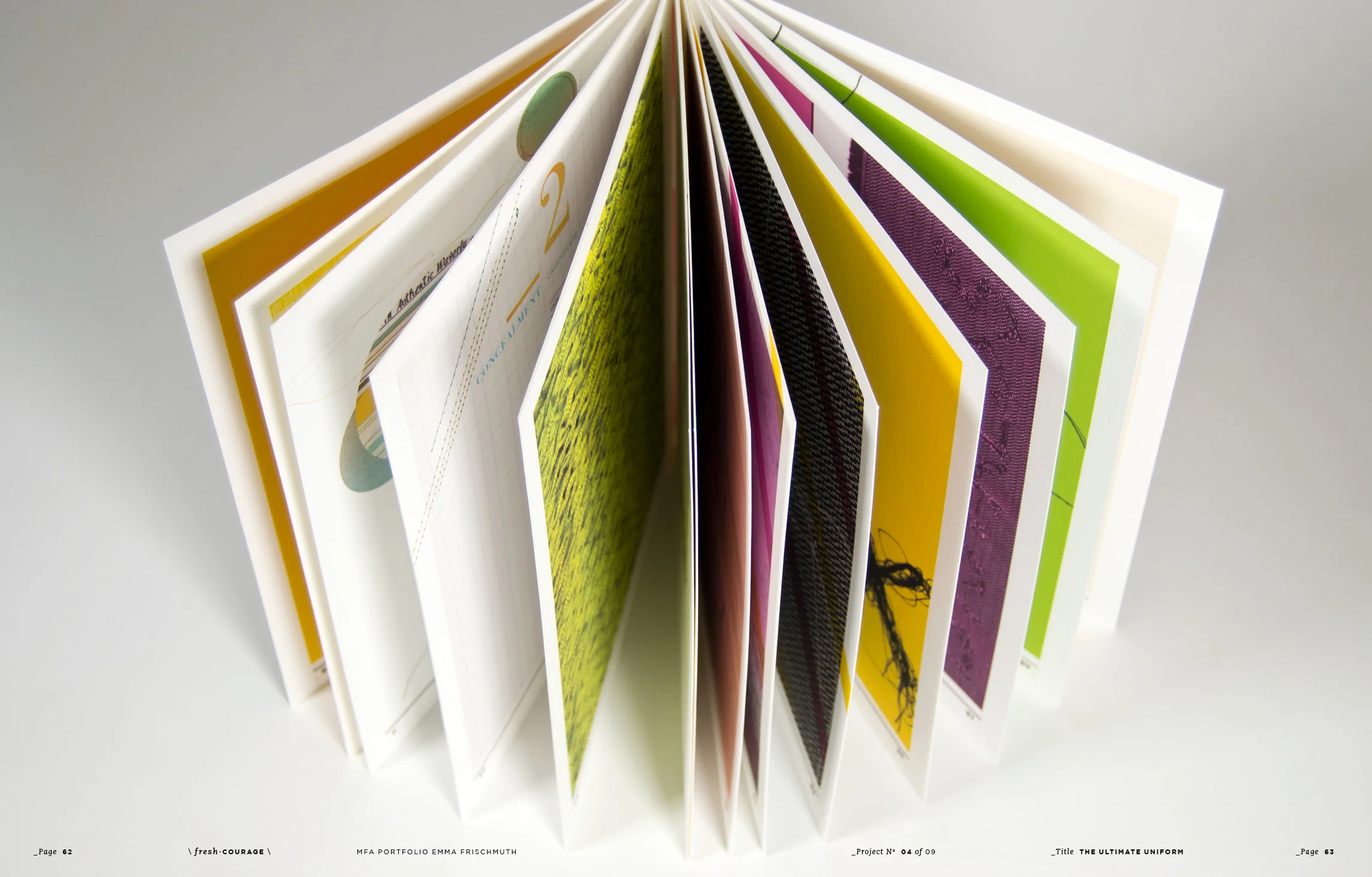
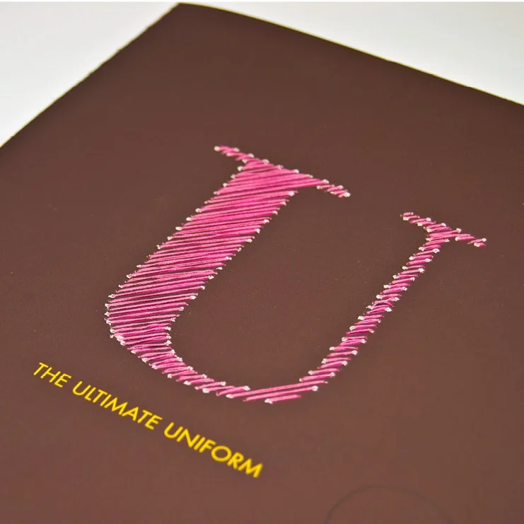
I chose to delve into the idea of clothing in our society. I posed the questions, what is the ultimate uniform and can we really tell who someone is by their clothes? I used these ideas as a as a jumping off point to experiment with typography, layout, color, and process.
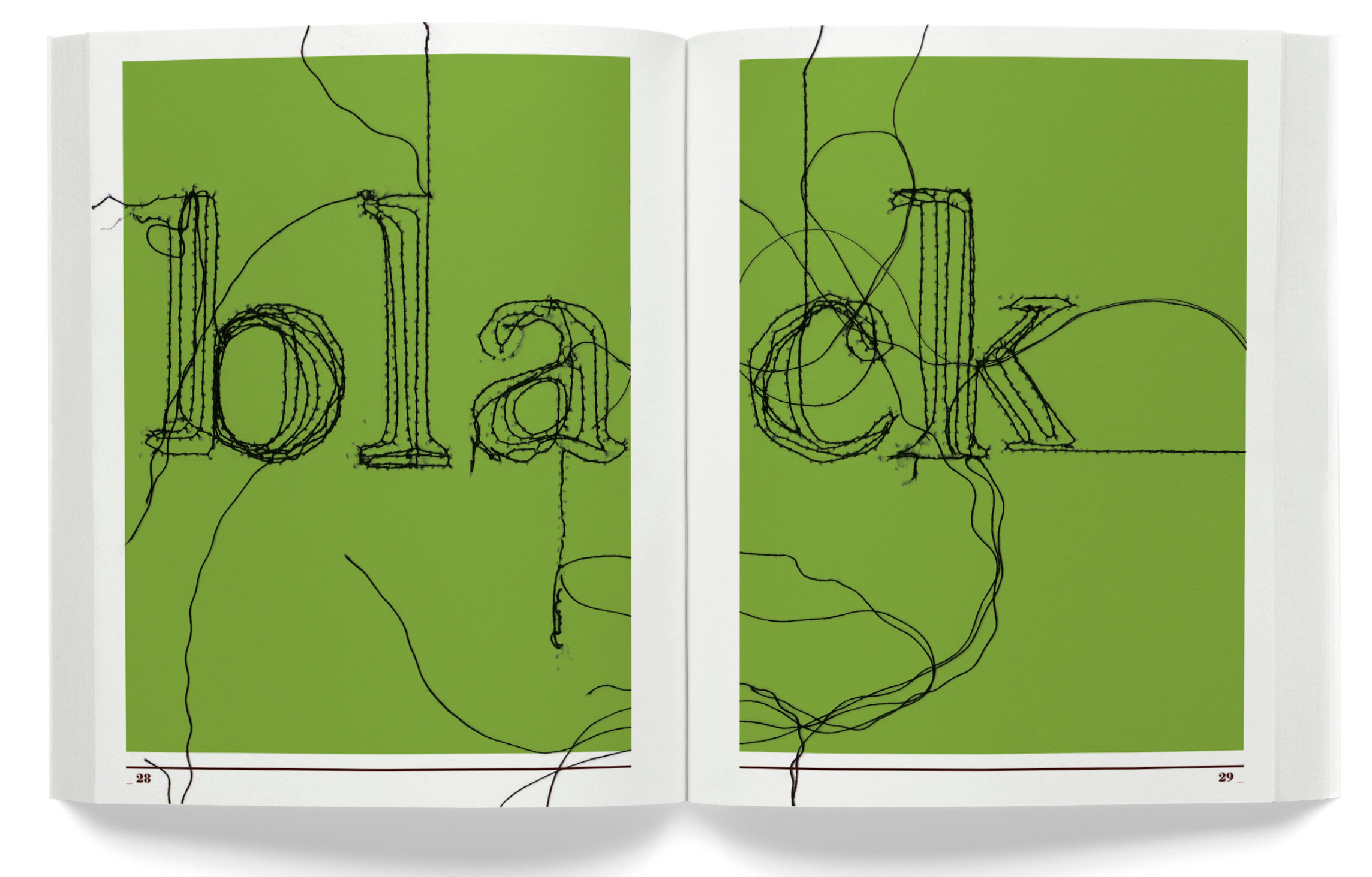
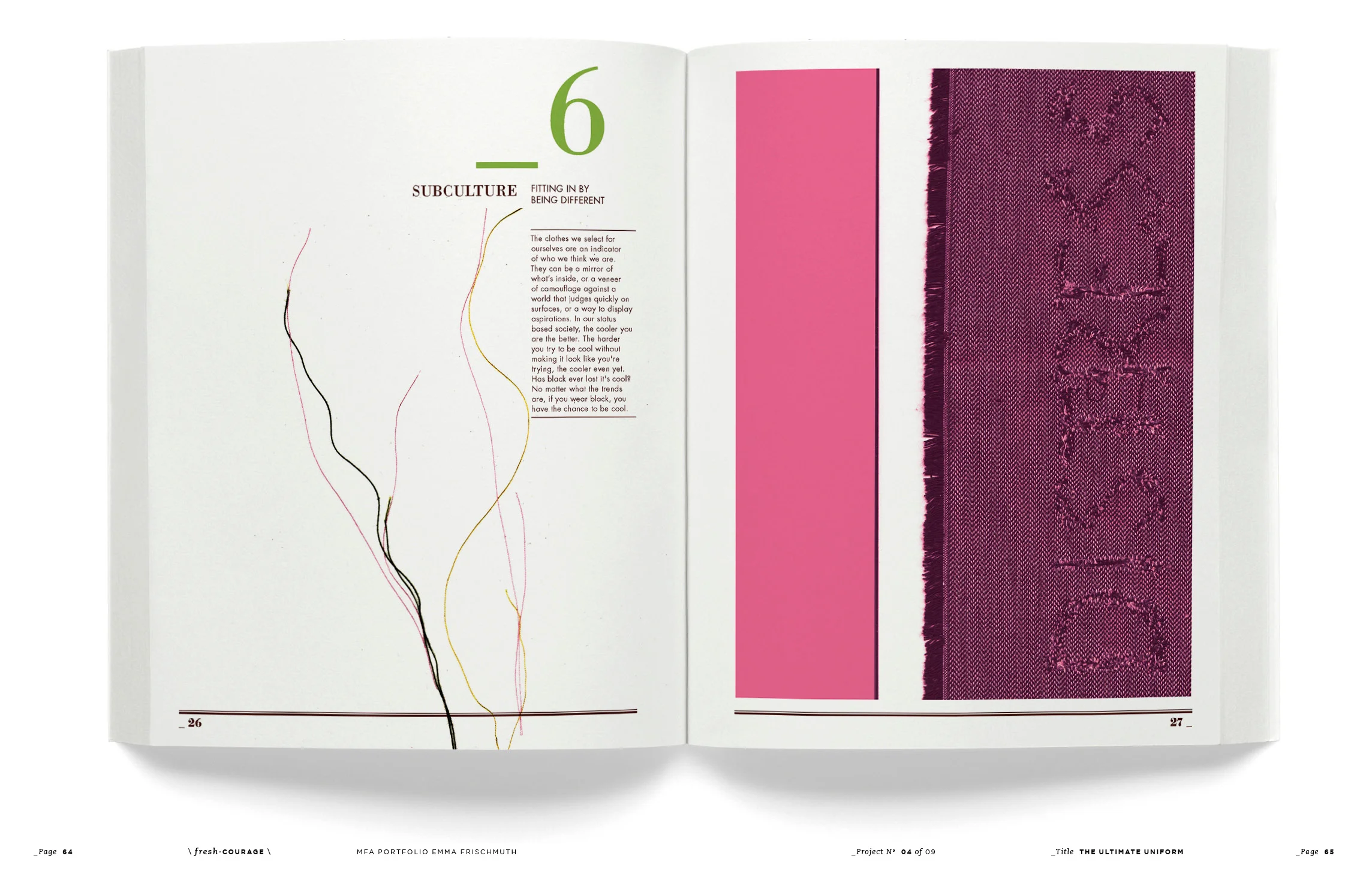
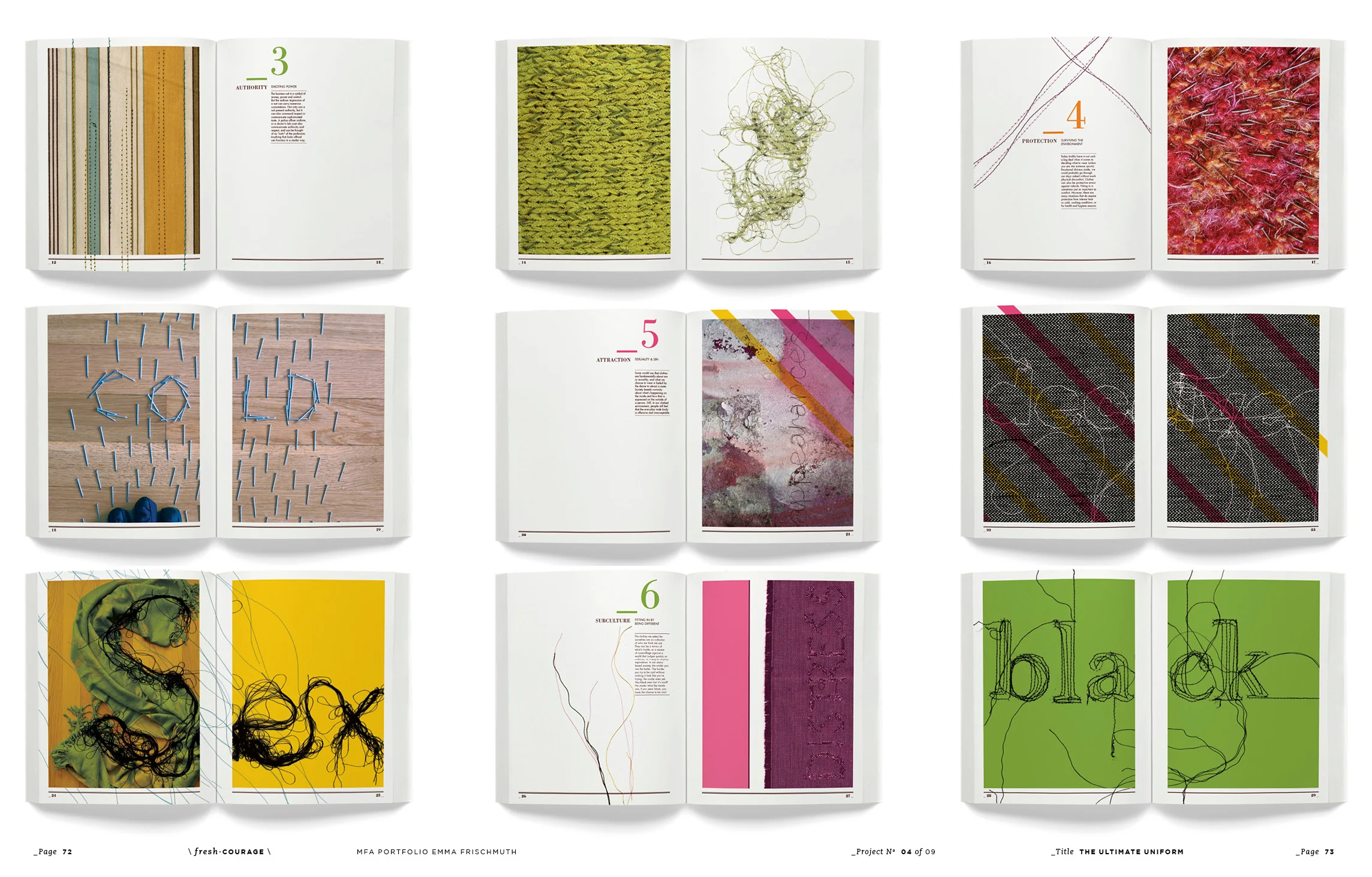
The finished book is a typographic exploration of my research, observations, and conclusions around clothing and society. As humans, we often craft our appearances in particular ways, especially in certain situations, to express a feeling, to somehow fit in, or meet certain expectations. In continuing with the theme of clothing, I literally sewed threads and words into the pages to hold them together, creating a rich texture and tactile quality. I explored several main reasons for wearing clothing such as ubiquity and fitting in with the crowd, concealment and camouflage, authority and emoting power, protection and surviving the elements, attraction and sexuality, subculture and fitting in by being different, and finally uniformity by being naked. Each spread is a composed visual and textural representation of these ideas.
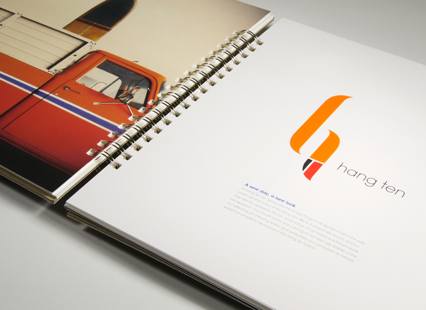
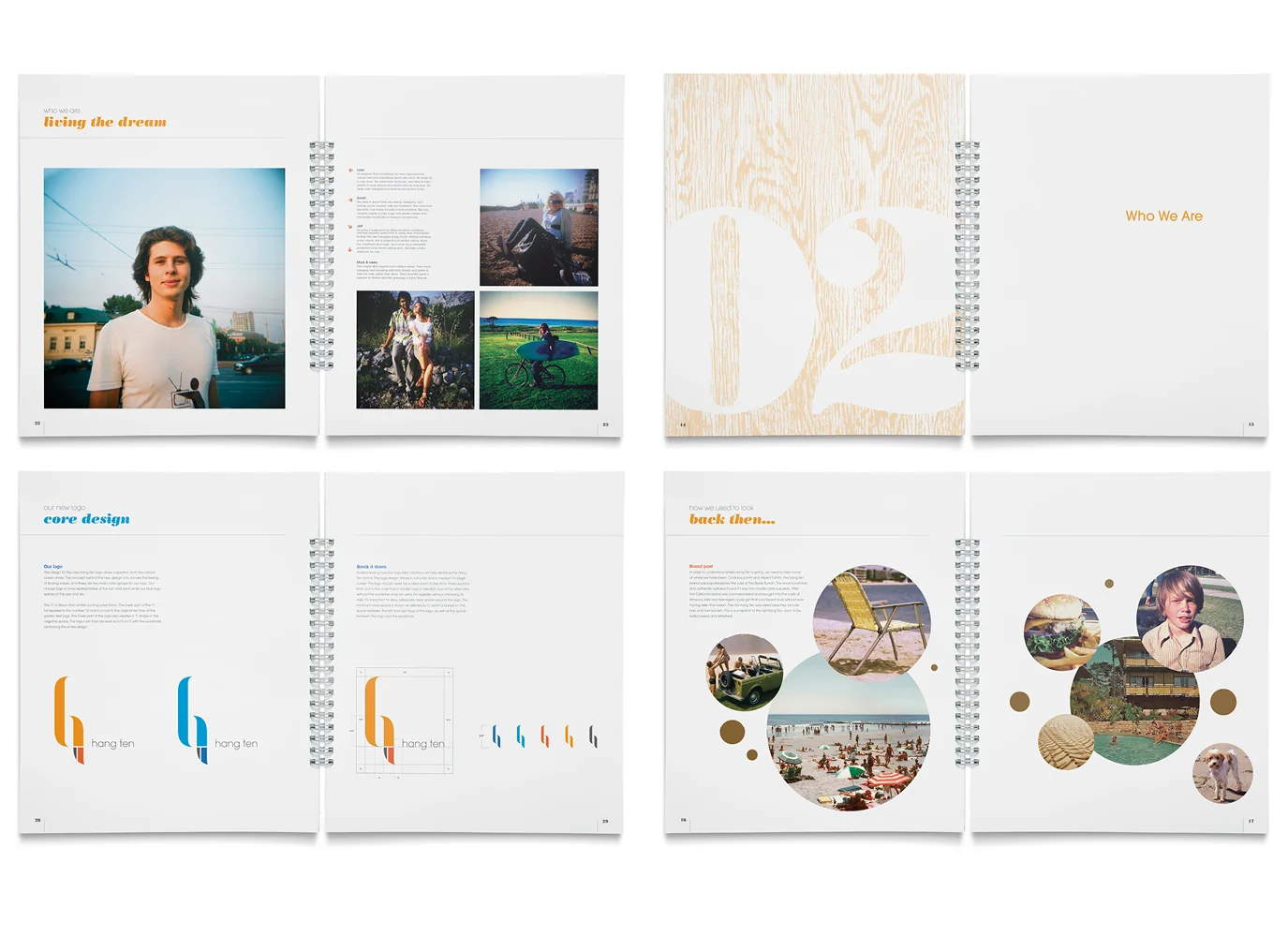
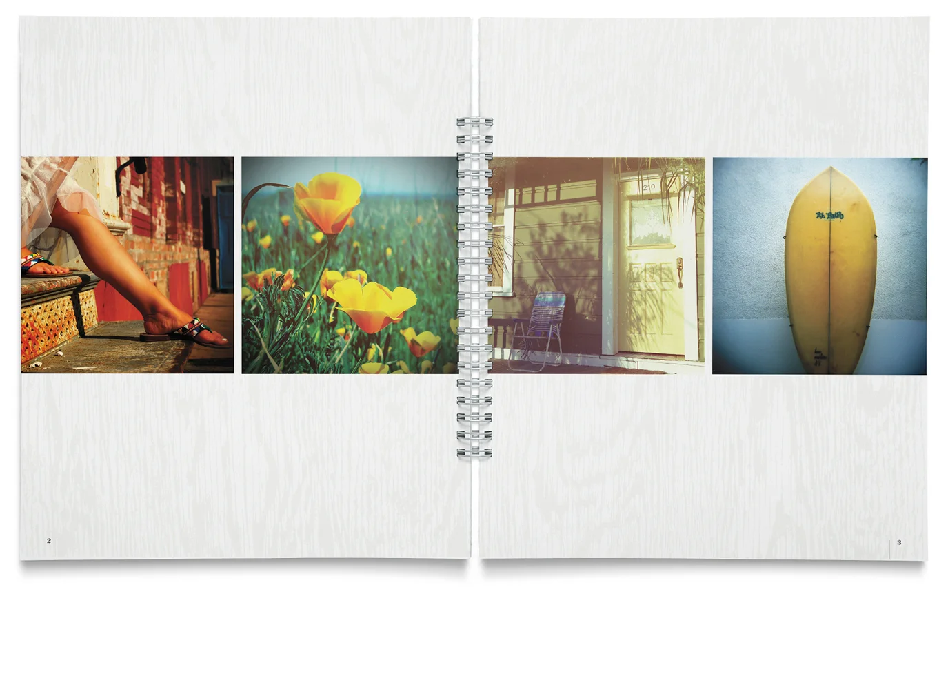
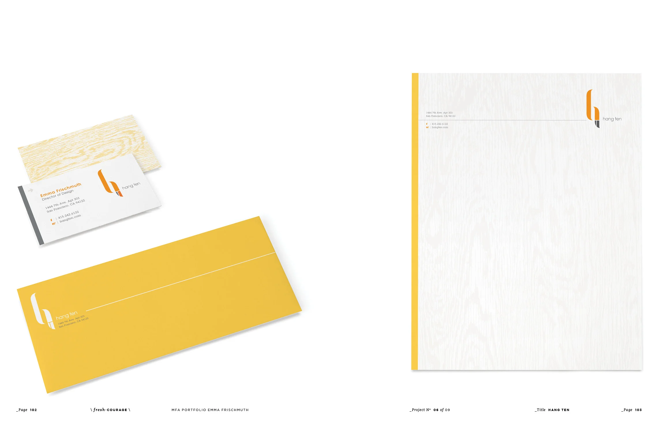
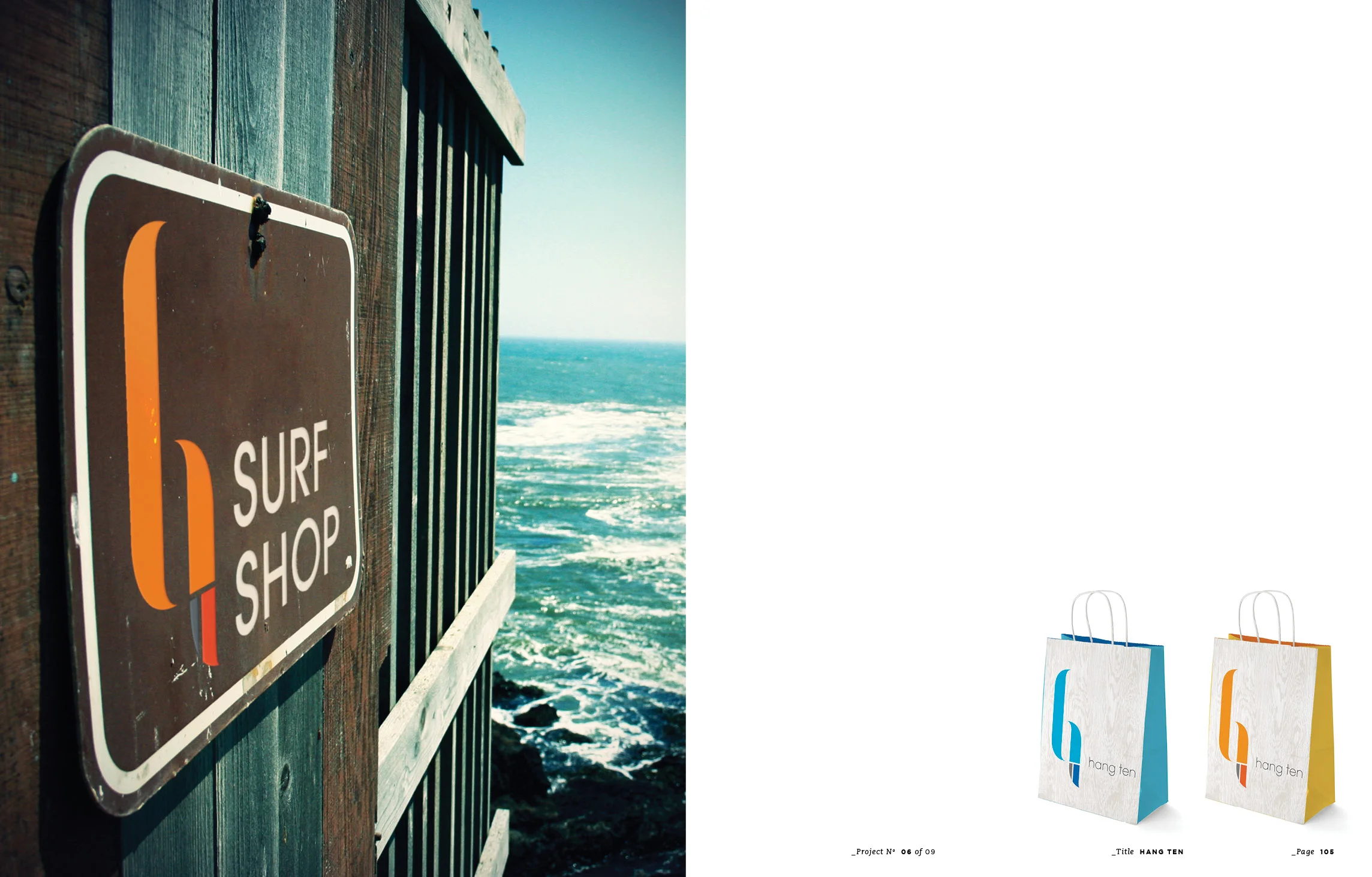
I researched a dying or defunct brand that would benefit from a
complete rebranding effort. After selecting the surf ware company, Hang Ten, I reinvigorated it through the strategic development of a new identity, visual brand standards, and by extending the brand offerings into new territories.
The love of nature, beautiful places and a laid back culture is reinforced and reflected in this brand refresh. Hang Ten has now been transformed from “the original surf brand” into “the new California dream.” The final project is presented as a brand standards book that conveys the new look and feel of Hang Ten, as well as brand extensions such as surf rentals and lessons, music festivals, and vacation destinations to truly experience the new brand.